Illustrator: ‘I Love Glasgow’


Illustrator.jpg

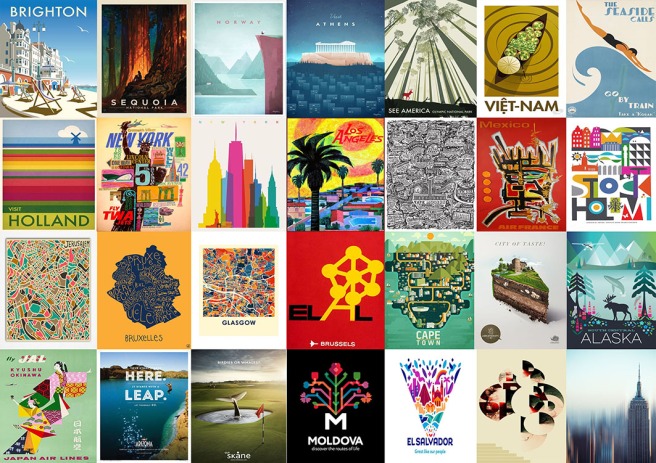
Travel Poster Illustrator: ‘I love Glasgow’ 

Vector image A3; resized to JPEG 300DPI A3 for upload to blog

Images created using vector graphics layered on top of text layers. Shapes were created using the curved pen tool and then filled and manipulated using blur and distort. The Duke of Wellington was created using the paintbrush tool and the knife tool.

The text layers were added using the text tool mainly and the pen tool. Opacity and hue were manipulated to match the image created in photoshop. I alternated between putting outlines on each of the letters. I applied black 1.0 weight outline to some and 3.0 white to others to achieve the glow effect that is on the photoshop image.

In order to create the cut-outs of shapes, I used the eraser tool.  I manipulated the tool by creating a zero round-ness eraser shape and used the alt key to keep it in a straight line.

Finally there I applied the distort tool to the background multiple times in order to create the rippled effect which is on the photoshop image.
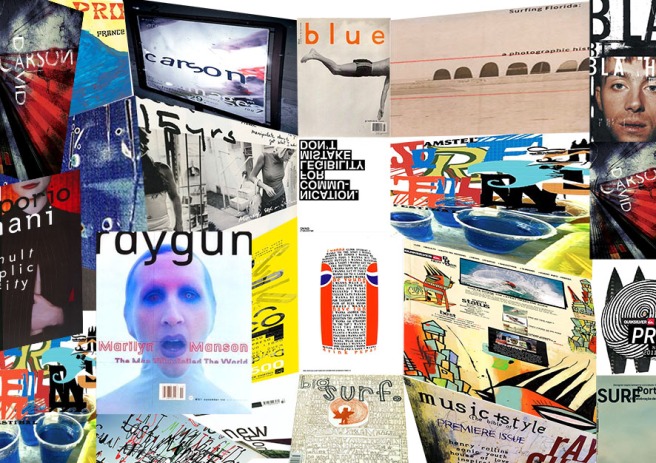


Photoshop Two: “I love Glasgow”

Poster Design 2 - David Carson

Travel Poster Design Two: ‘I Love Glasgow’

BITMAP Image; 300DPI; A3; reformatted as JPEG A3 150DPI for upload to blog. 

The second poster design took inspiration from David Carson. I wanted to use his style of big typeface and dark abstract imagery.

The poster was built around an image of the iconic Duke of Wellington statue on Queen Street. The image was cropped and cut to leave only the statue. The image was then pasted again and heavily warped using the zig-zag tool to create the dark wavy blur that is the background. This was pasted over the second time and the wave effect was used to create the even darker background behind the statue.

I adjusted the levels in the background to create the black effect which in turn made the ripples of the overlaid layer stand out. The ripple was then manipulated again using the mosaic tool to create the acid drip effect.


To fill the white space text was used with a motion blur effect. Then the final typeface was overlaid on top of the image using various letters from ‘Glasgow’ and different sizes in Carson’s style.

Photoshop One: “I Love Glasgow”

Poster Design 1 - Paula Scher

‘I Love Glasgow’ Travel Poster Design One

BITMAP image; 300DPI, A3; Re-formatted to JPEG 150 DPI A3 for upload to blog.

For the first travel poster design, I took inspiration from Paula Scher. I wanted to incorporate her use of text as shapes. I built the image around a manipulated photograph of the Glasgow Clyde Harbour. The photograph was warped using polar coordinates to create the tiny planet effect seen and the saturation was reduced to zero.

The only permitted colours were red so the saturation was either reduced to zero in all parts of the image or the fill tool was used to create the red.

Layers were then added. The gradient tool to create the striped effect on the left and the text tool with a motion blur for the background. Finally, the text was added as a final layer on top to complete the image. For the text to stand out I used a bold font and made sure to change the colour of the ‘I love Glasgow to make it stand out the most. I then placed a vector graphic behind it and reduced the opacity to make it seem like part of the text.

The outer glow tool was used on some of the text to again make it stand out.


Travel Poster Design

TRAVEL POSTER RESEARCH

Back to Photoshop class. This term we are expected to produce a higher standard of work than last year. 4 travel posters are to be made; 2 on Photoshop and 2 on Illustrator. A3 in size and all differing in style. We are to draw inspiration from MILTON GLASER, PAULA SCHER , NEVILLE BRODY  and/or DAVID CARSON. The message of the poster is ‘I love Glasgow.’ Should be fun!